Know Your Widgets: Row and Column
So, the next widget in our series is not just a single widget, in fact, we would be covering two different widgets in this blog, namely Row and Column. The reason behind integrating two widgets together is the fact these two widgets have similar properties which will help you understand them efficiently.
So, by now you must be familiar with what flutter is and what widgets are. We know everything in Flutter is a widget that means everything you see on a screen is a widget in a Flutter and flutter have lots of widgets, widgets for almost every functionality you wanna put it, if you head over to flutter widgets at flutter.dev you will find a whole list of widgets.
Similarly, Row and Column are also widgets in Flutter and mostly every layout can be broken down in row and column, it’s that important. So let’s explore them individually …
Row
Let’s suppose you want to display a number of widgets in a horizontal manner on the screen, like a Text and an Image and I’m pretty sure you will find this minute requirement everywhere in a layout. That’s where Row widget comes in use, which displays the widgets in a horizontal manner.
A row is a multi-child layout widget which takes in a list of widgets as its children. A row displays the widgets within the visible view i.e. it doesn’t scroll. Use ListView widget to create a scrollable list of widgets, we’ll discuss this widget further in the series.
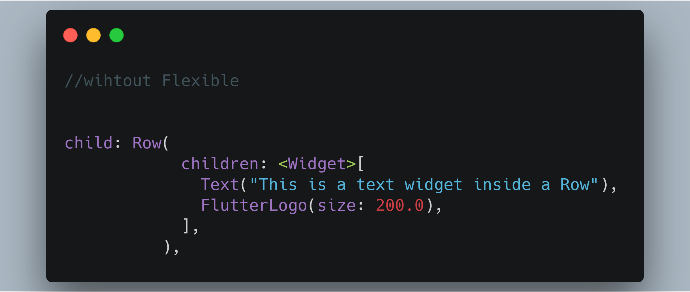
For now, consider this code snippet which contains Row widgets containing Text widget wrapped in Flexible widget and a FlutterLogo widget.

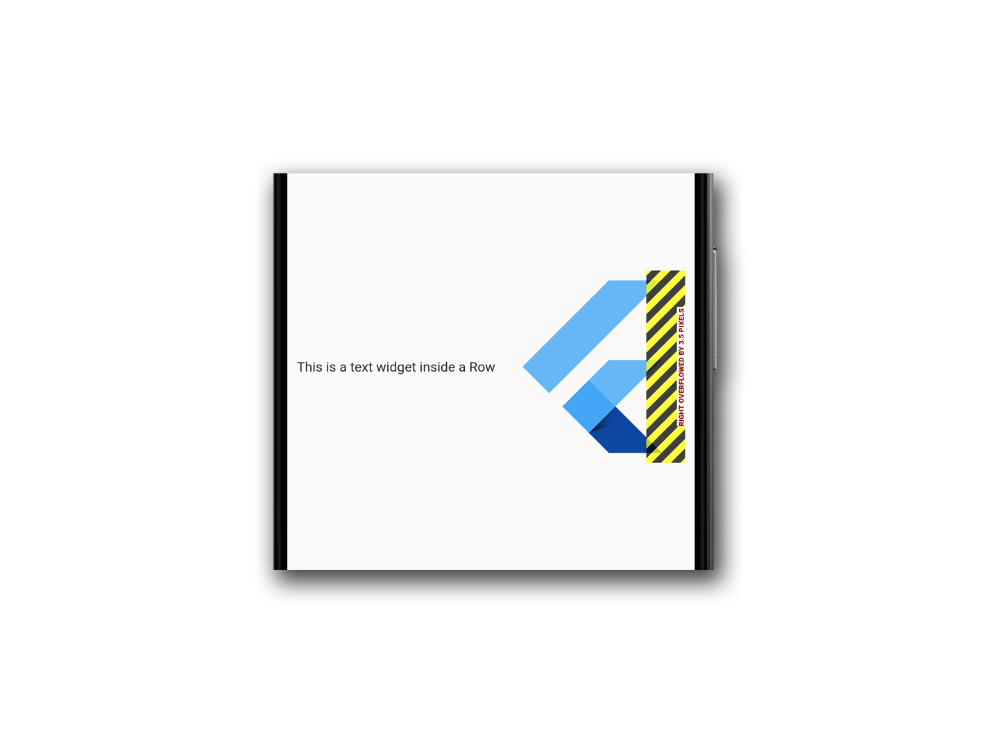
This code will display a text and flutter logo in a row as shown in the pic below.

Note: Flexible widget is used to wrap the text because if the content of the row is wider than the row itself, then the row is said to have overflowed. When a row overflows, the row does not have any remaining space to share between its children and the row reports this by drawing a yellow and black striped warning box on the edge that is overflowing. Refer to the code snippet and the output below for the overview of the issue and importance of Flexible or Expanded.
We will talk about the Flexible and Expanded widgets in other blogs, for now just understand its use.

Column
Now, we know that to lay the widgets in a horizontal manner we can use a Row widget but what to do when you have to lay the widgets in a vertical manner, that’s where Column widget comes in play.
Column widget alike row is a multi-child layout widget which takes in a list of widgets as its children.
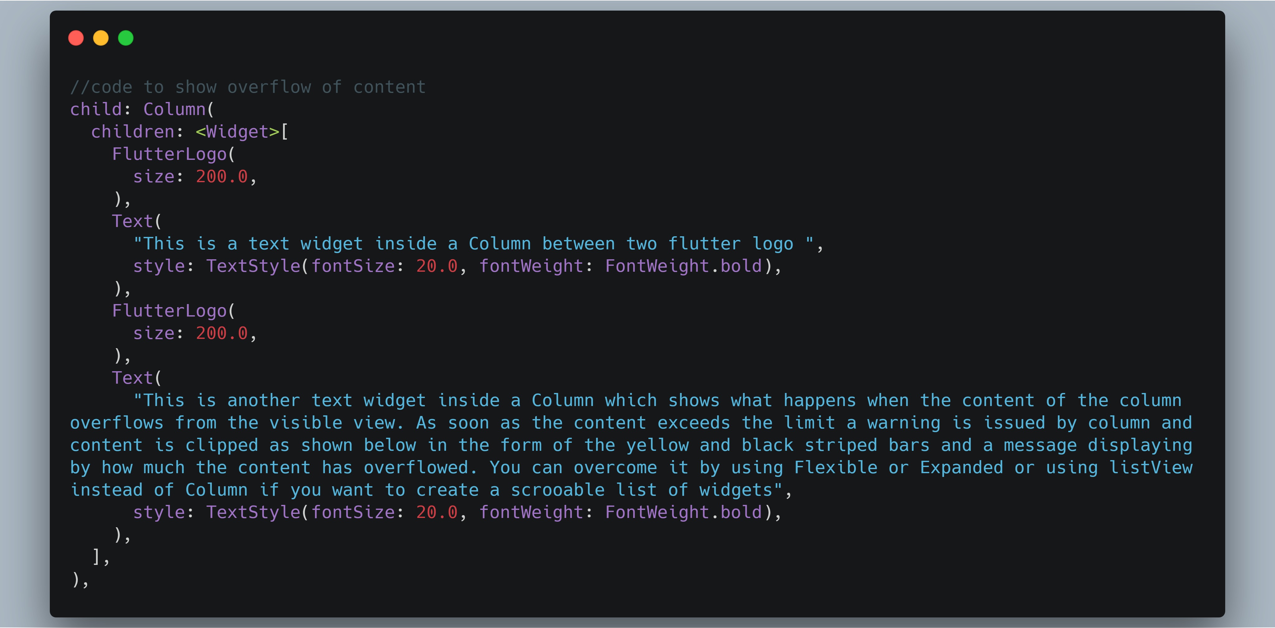
Consider this code snippet which contains a Column widgets containing two flutter logos and a text widget.
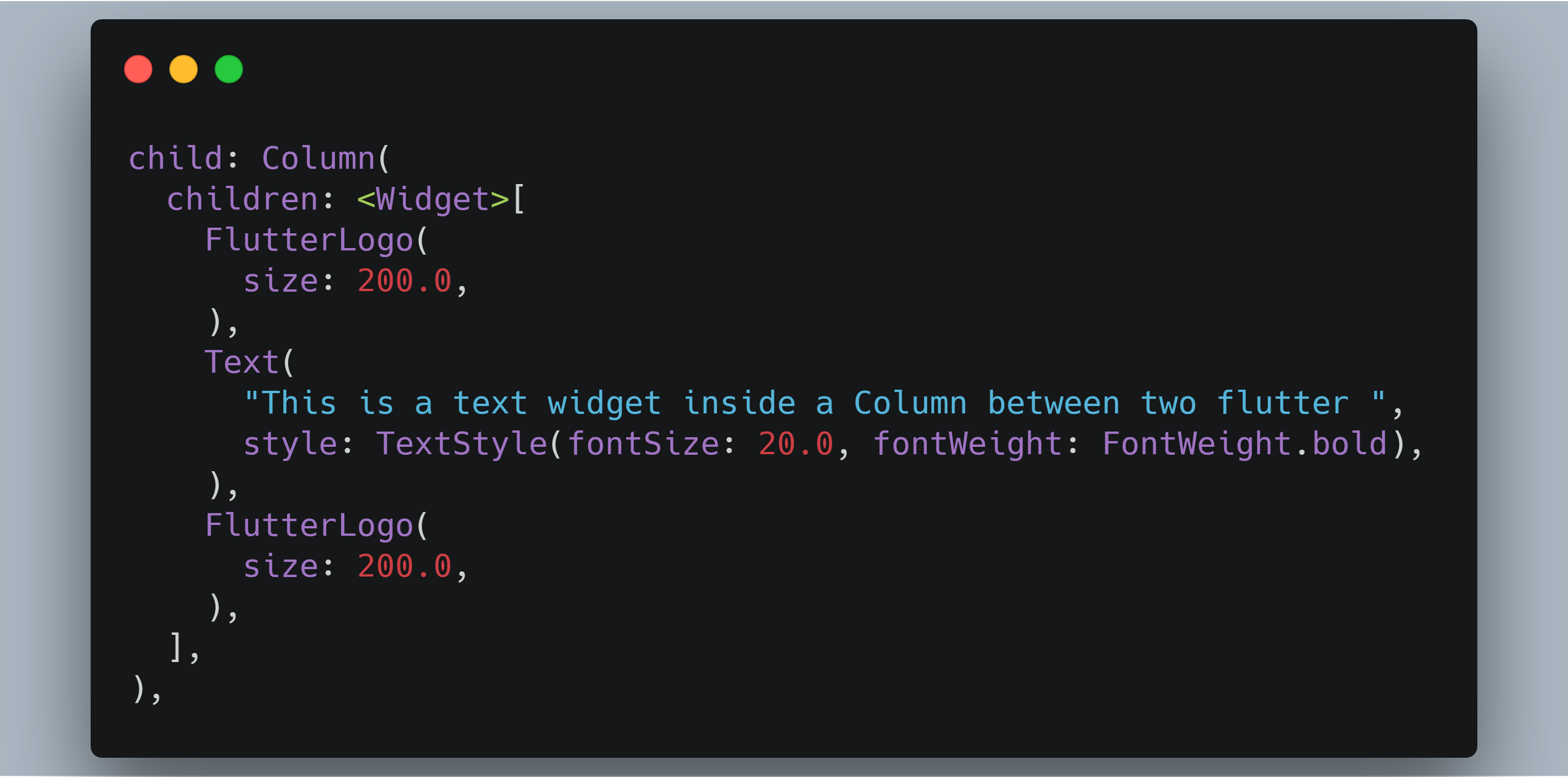
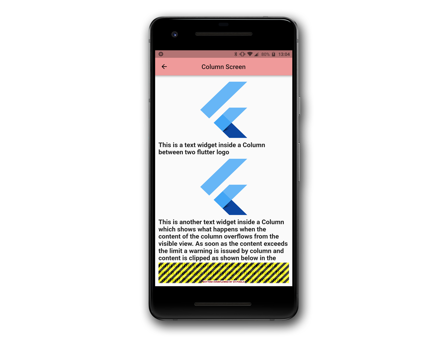
This code will display a Text between two Flutter logos as shown in the pic below,
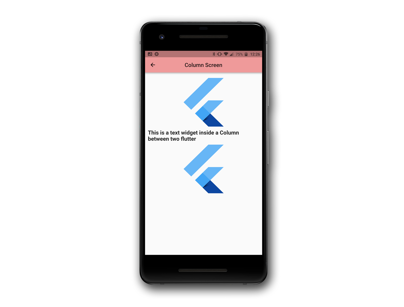
Note: Here we didn’t have to wrap the children inside Column with either Flexible or Expanded widgets because for now the content of the children fit the column view perfectly but you might come across a situation where your content of the Column exceeds the amount of space available, in that case the Column overflows resulting in your content getting clipped and a warning is display in the form of yellow and black striped bar indicated at the overflowing edge with a message telling by how much your content has overflowed. Refer to the code snippet and the output below to get an overview of the overflow situation. One can use the Flexible or Expanded widgets to restrict the content to the visible view of the screen but if you want a scrollable vertical list of widgets then use a ListView instead of Column.

Properties of Row & Column
By now you must have a vivid overview of,
-
- What are Row and Column widgets?
- How to use Row and Column.
- When to use and when not to use?
- Basic problems faced with Row and Column
- And how to deal with it.
Now moving forward let’s look for their properties and see what functionality either of the widgets offers though Row and Column have the same set of properties but works in a slightly different manner. Let’s see those properties.
Row properties:
Here is the constructor of the row with some default values,

Column properties:
Here is the constructor of the column with default values,
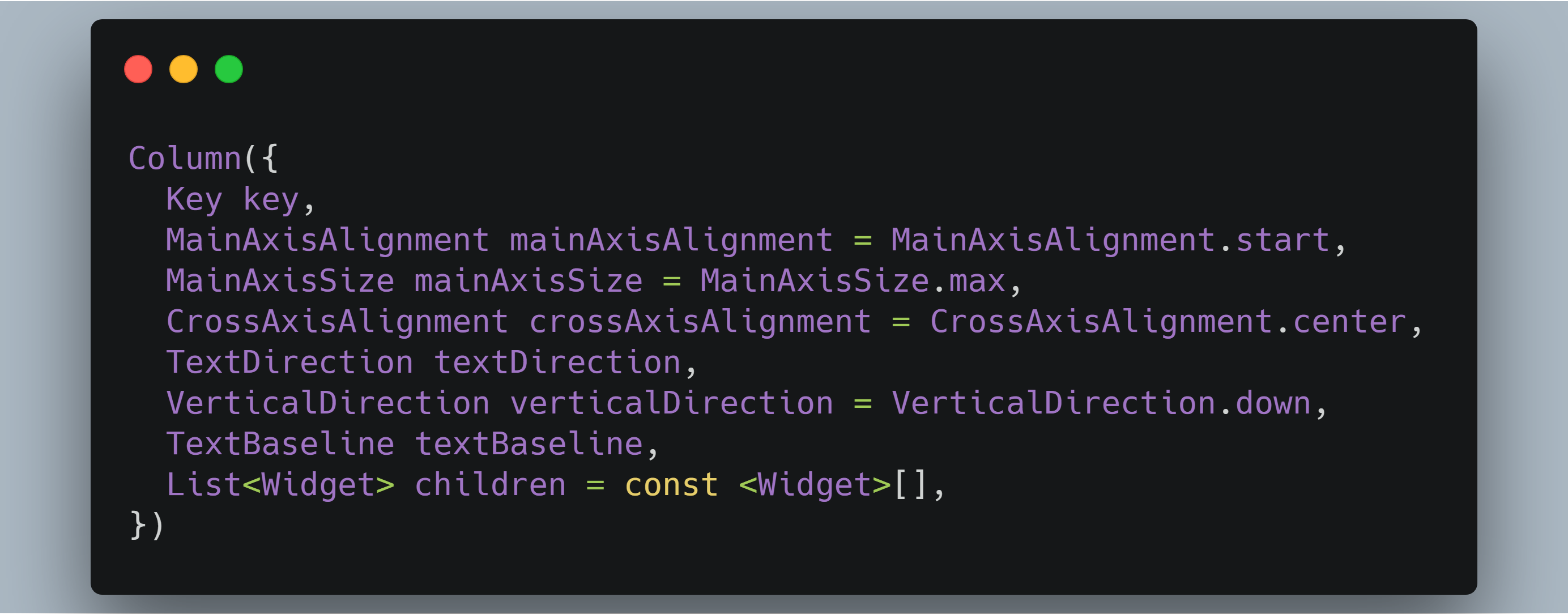
It’s clear from the constructors that they have similar properties but their usage differs, so we’ll discuss each property by comparing their usage in both row and column.
mainAxisAlignment
This property positions children widgets along the main axis of the layout.
center
This positions the children as close to the middle of the main axis as possible.

end
This positions the children as close to the middle of the main axis as possible depending on the textDirection.

spaceAround
This distributes the free space evenly between the children and half of that free space is used before and after the first and last child respectively.

spaceBetween
This distributes the free space evenly between the children.

spaceEvenly
This distributes the free space evenly between the children and before and after the first and last child respectively.

start
This positions the children close to the start of the main axis depending on the textDirection.

mainAxisSize
This property directs how much space the children should occupy in the main axis. In the layout, after allocating spaces for the children there might be some free space. mainAxisSize tells whether to maximize or minimize the free space.
min
It minimizes the amount of free space along the main axis.

max
It maximizes the amount of free space along the main axis.

crossAxisAlignment
This property positions children widgets along the cross axis of the layout.
start
This positions the children start edge to the start side of the cross axis.
For ex: if this is used in a column with the textDirection set to TextDirection.ltr, it aligns the left edge of the children to the left edge of the column.

end
This positions the children as close to the end of the cross axis.
For ex: if this is used in a column with the textDirection set to TextDirection.ltr, it aligns the right edge of the children to the right edge of the column.

center
This positions the children such that their center aligns to the middle of the cross axis. By default the value of crossAxisAlignment is center.

stretch
This lets the children to completely occupy to the cross axis.

baseline
This positions the children such that their baseline match.

textBaseline
It’s the horizontal line used for aligning the text.
textDirection
This property determines the order in which to lay the children horizontally.
rtl
It lays the children from right to left direction.

ltr
It lays the children from left to right direction.

verticalDirection
This property determines the order in which to lay the children vertically.
children
Both these widgets, Row and Column, takes a list of widgets as its children.
So, these were the properties that are included in Row and Column widget, the purpose was to give you an overview of Row and Column widget in the flutter, now it’s your time to explore them and get more familiar with the in-hand experience. remember, the basic rule that we are made familiar with right from childhood is If you don’t practice, you don’t learn. Implement these properties yourself and let us know if we made a mistake or left out something.
If you want to read more about row and column head over to the flutter docs of Row and Column.
Related articles:
Keep exploring other widgets with FlutterDevs, from:
- Know Your Widgets: Cuppertino ActionSheet In Flutter
- Know Your Widgets: Container In Flutter
- Know Your Widgets: Scaffold
FlutterDevs team of Flutter developers to build high-quality and functionally-rich apps. Hire flutter developer for your cross-platform Flutter mobile app project on hourly or full-time basis as per your requirement! You can connect with us on Facebook and Twitter for any flutter related queries.
Post a Comment
You must be logged in to post a comment.



Otilia
November 26, 2020Hardwood household furniture possesses one thing very natural regarding it.
There is this sense of coziness, of attributes and of style that may
be actually be found in hardwood furnishings. Wood is actually birthed from the earth.