


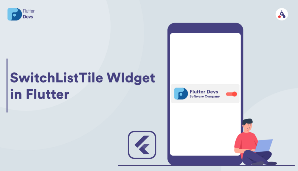
SwitchListTile Widget In Flutter
Flutter, to build any application, we start with widgets. The structure block of flutter applications. Widgets depict what their view ought to resemble given their present setup and state. It incorporates a text widget, row widget, column widget, container widget, and some more.
Every component on a screen of the Flutter application is a widget. The screen’s perspective totally relies on the widgets’ decision and sequence used to build the application. What’s more, the structure of the code of an application is a tree of widgets.
In this article, we will explore SwitchListTile Widget In Flutter. We will also implement a demo program, describe properties, and use them in your flutter applications.
Table Of Contents::
Flutter
SwitchListTile
Properties
Code Implementation
Code File
Conclusion
Flutter :
Flutter is Google’s UI toolkit that helps you build beautiful and natively combined applications for mobile, web, and desktop in a single codebase in record time.
To begin with, you’ll need the necessary information on Flutter, Git, and GitHub. If you are new to flutter, you can get started by reading the official documentation on flutter. Dev.
SwitchListTile :
A ListTile with a Switch. At the end of the day, a switch with a mark. It is likewise a Widget that has no capacity state. Need to control the state through stateful parent widgets.
OnChanged is considered when the condition of the Switch changes. The callback boundary is bool, and the genuine methods it is chosen. False methods are unchecked. Value property Indicates if to empower, control the condition of the Switch by controlling this. We can click and can slide too.
Properties :
The following are the basic properties of the SwitchListTile:
- > value: In this property to initialize whether this Switch is selected. True means checked, false means unchecked.
- > onChanged: In this property, when dragging, the callback changes state /when opening and closing.
- > activeColor: In this property, the background color of the button when the value is true. Then, the color was changed.
- > activeTrackColor: In this property, when selected, the color of the slide was changed.
- > activeThumbImage: In this property, the picture of the slider when selected.
- > inactiveThumbImage: In this property, the picture of the slider when unchecked.
- > title: In this property, title Typical is Text.
- > subtitle: In this property, subtitles Below the title is typically Text.
- > inactiveThumbImage: In this property, the image on the slider when the value is false. If inactiveThumbColor is also set, the inactiveThumbImage will prevail.
- > secondary: In this property, one thing on the left side.
How to implement code in dart file :
You need to implement it in your code respectively:
Create a new dart file called
switch_list_tile_demo.dartinside thelibfolder.
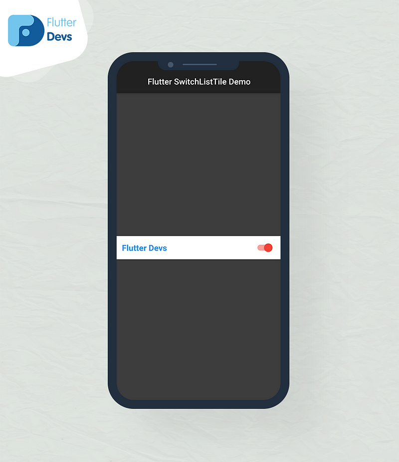
In this switchListTile, we will use only the title and the title can take any widget, but it is generally going to be a Text widget.
Card(
  color: Colors.white,
  child: SwitchListTile(
    title: Text('Flutter Devs',style: TextStyle(
        color: Colors.blue,
        fontWeight: FontWeight.w800,
        fontSize: 20
    ),
    ),
    value: _flutter,
    activeColor: Colors.red,
    inactiveTrackColor: Colors.grey,
    onChanged: (bool value) {
      setState(() {
        _flutter = value;
      });
    },
  ),
),
We will wrap SwitchListTil() on the Card widget, add active color was red, inactive track color was grey. We will make a bool variable and call it on value and onChanged method.
bool _flutter = false;
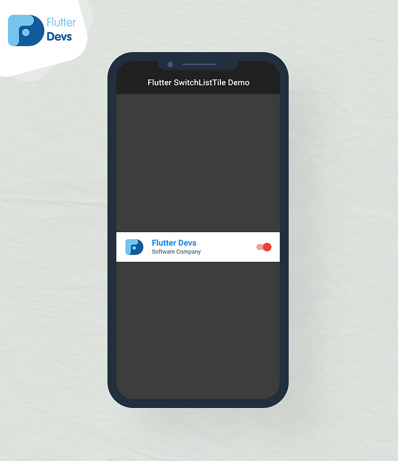
We will add an image and subtitle; the image will be shown in the leading position, and subtitles will show smaller text below the title.
Card(
  color: Colors.white,
  child: SwitchListTile(
    title: Text('Flutter Devs',style: TextStyle(
        color: Colors.blue,
        fontWeight: FontWeight.w800,
        fontSize: 20
    ),
    ),
    value: _flutter,
    activeColor: Colors.red,
    inactiveTrackColor: Colors.grey,
    onChanged: (bool value) {
      setState(() {
        _flutter = value;
      });
    },
    secondary: Image.asset("assets/devs.jpg",),
    subtitle: Text('Software Company',style: TextStyle(
      color: Colors.blueGrey[600],
    ),
    ),
  ),
),
We will add an image on the secondary method, then run the code image on your devices.
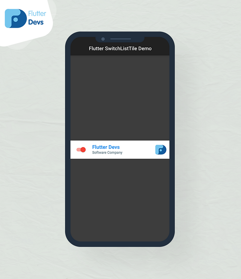
We will change the slider positioned on the contolAffinity method. In this method, you will be set your slider positioned.
controlAffinity: ListTileControlAffinity.leading,
When we run the application, we ought to get the screen’s output like the underneath screen video.

This video shows how to create a SwitchLisTtile in a flutter and shows how SwitchLisTile will work in your flutter applications using properties, and then they will be shown on your device.
Code File :
import 'package:flutter/material.dart';


class SwitchListTileDemo extends StatefulWidget {
  @override
  _SwitchListTileDemoState createState() => _SwitchListTileDemoState();
}

class _SwitchListTileDemoState extends State<SwitchListTileDemo> {

  bool _flutter = false;

  @override
  Widget build(BuildContext context) {
    return Scaffold(
      backgroundColor: Colors.white24,
      appBar: AppBar(
        title: Text('Flutter SwitchListTile Demo'),
        centerTitle: true,
        automaticallyImplyLeading: false,
      ),
      body: Center(
        child: Card(
          color: Colors.white,
          child: SwitchListTile(
            title: Text('Flutter Devs',style: TextStyle(
                color: Colors.blue,
                fontWeight: FontWeight.w800,
                fontSize: 20
            ),
            ),
            value: _flutter,
            activeColor: Colors.red,
            inactiveTrackColor: Colors.grey,
            onChanged: (bool value) {
              setState(() {
                _flutter = value;
              });
            },
            secondary: Image.asset("assets/devs.jpg",),
            subtitle: Text('Software Company',style: TextStyle(
              color: Colors.blueGrey[600],
            ),
            ),
            controlAffinity: ListTileControlAffinity.trailing,
          ),
        ),
      ),
    );
  }
}
Conclusion :
In the article, I have explained the SwitchListTile widget in a flutter; you can modify this code according to your choice. This was a small introduction to SwitchListTile On User Interaction from my side, and it’s working using Flutter.
I hope this blog will provide you with sufficient information in Trying up the SwitchListTile widget in your flutter projects. We will show you what is SwitchListTile, some property using in SwitchListTile, and make a demo program for working SwitchListTile in your flutter applications, So please try it.
❤ ❤ Thanks for reading this article ❤❤
If I got something wrong? Let me know in the comments. I would love to improve.
Clap 👏 If this article helps you.
find the source code of the Flutter SwitchListTile Demo:


Post a Comment
You must be logged in to post a comment.